In a sense the choice of font is trivial. As long as the Chart is available in HTML form, with the symbols assigned their appropriate Unicode encodings, it is a simple matter for the user to choose the font to use for displaying it, just as with any kind of plain-text (non-graphic) web page.
Nevertheless, this does seem to be a suitable moment to revisit the shape of one particular symbol, namely that for the voiced alveolar lateral fricative, which in our usual font for this blog (= Segoe UI or Lucida Grande) looks like this: ɮ.
So if you forgive me I’ll recycle part of my blog for 3 Nov 2006, when I ventilated this issue.
The problem is that the shape ɮ is not exactly in accordance with the official decision made by the IPA Council when the symbol was first adopted, in 1938, which reads as follows (m.f. 61, p.15).
Translated from the phonetically transcribed French, it reads as follows:
The proposal to replace ɮ by [the second symbol shown] is therefore approved. We think nevertheless that the form proposed by Chatterji can be employed without disadvantage by those who prefer a symbol less remote from the old ɮ.
Chatterji’s proposal was a compromise between the ʒ-shaped right-hand side of the ‘old’ symbol and the straight side of the ‘new’. This compromise shape is the form that Daniel Jones adopted for the symbol in the 1949 Principles booklet (p. 11, also p. 50):
Except as graphics (above), I can display neither Chatterji’s compromise nor the form approved in 1938 — because they are not represented in the fonts available to our computers. Remarkably, this formal decision by the IPA seems to have been somehow forgotten or overlooked as we moved from hot metal typography to software fonts.
I do not recall any decision either at the 1989 Kiel Convention of the IPA or elsewhere to change back to the older shape. But the IPA Handbook presents the symbol as an “L-Ezh ligature”, and our current Chart shows the form ɮ. Unicode calls it LATIN SMALL LETTER LEZH (U+026E). All available computer phonetic fonts show the same ɮ shape.
Ah well, I suppose this is only a question of mere glyph variants. And it’s probably too late now to do anything about it even if we wanted to.
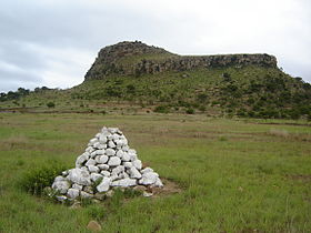
By the way, the Unicode book also repeats the Principles assertion that ɮ is “dhl” in Zulu orthography. But Zulu has had a spelling reform, and (as rightly recognized in the IPA Handbook) the current spelling is “dl”. The same applies to the related language siSwati. The surname of the Swazi royal family is Dlamini ɮaˈmiːni, and in Zulu ‘to eat’ (with the infinitive prefix uku-) is ukudla uˈɠúːɮa. The site of the famous battle that used to be spelt Isandhlwana is now written Isandlwana. It’s still pronounced [ísanˈdɮwáːna]. (After /n/ you get a laterally released affricate rather than the lateral fricative used in other positions.)


Is the 'approved' form this?
ReplyDeleteMore or less!
ReplyDeleteFrom time to time I revisit Google's webfonts to see whether they have a suitable IPA font, and appearently now they have. The font Voces by Ana Paula Megda and Pablo Ugerman seems like a good choice for people who want to embed a free IPA font into their website.
ReplyDeleteSure, their ɮ also has the lezh form (a more complete picture with the font's glyphs can be seen at luc.devroye.org).
I have a definite memory (which my not mean it's right of course!) that there was indeed a resolution at Kiel to readopt the old symbol ɮ. I don't have my JIPAs at home (currently on sabbatical), but I will check if this is among the decisions listed in JIPA after the Kiel meeting next time I'm in my office at the university.
ReplyDeleteI recall discussion for and against the right-hand part of the symbol looking like the voiced post-alveolar fricative symbol.
Martin J Ball
How amazing it is that there is a word-to-word correspondence of the English translation to the original French!
ReplyDeleteIndeed. sɑ̃z ɛ̃kɔ̃venjɑ̃ surprised me, though. I assumed a final s must have got clipped from the right margin when scanning, but it turns out to be a false friend.
Delete__
Alan
fə fʊl neɪm siː prəʊfaɪl
You're right - and in the exact same order too!
DeleteAlthough to be fair JW's translation uses a slightly Romance-like word order, with "nevertheless" placed after the verb rather than at the start of the sentence, and "a symbol less remote from" rather than "a symbol that's closer to" or similar. Presumbly he was influenced by the French word order - perhaps even finger-translating it on the fly, like someone translating a French newspaper aloud.
P Mc Anena
It's always seemed to me a pity that the makers of Zulu orthography didn't adopt the digraphs 'sl' and 'zl' for 'hl' and 'dhl' (now 'dl') which would have shown the parallel voceles and voiced pair more neatly: 'dl' suggests an affricate. (Rider Haggard has the exiled Zulu prince Umslopogaas in which the first element is mhlophe [white]; see http://everything2.com/title/Umslopogaas)
ReplyDeletetweakbox
ReplyDeletetweakbox app
tweakboxx.infotweakbox
tweakbox app
tweakboxx.info
Haloo pak^^
ReplyDeleteKami dari SENTANAPOKER ingin menawarkan pak^^
Untuk saat ini kami menerima Deposit Melalui Pulsa ya pak.
*untuk minimal deposit 10ribu
*untuk minimal Withdraw 25ribu
*untuk deposit pulsa kami menerima provider
-XL
-Telkomsel
untuk bonus yang kami miliki kami memiliki
*bonus cashback 0,5%
*bunus refferal 20%
*bonus gebiar bulanan (N-max,samsung Note 10+,Iphone xr 64G,camera go pro 7hero,Apple airpods 2 ,dan freechips)
Daftar Langsung Di:
SENTANAPOKER
Kontak Kami;
WA : +855 9647 76509
Line : SentanaPoker
Wechat : SentanaPokerLivechat Sentanapoker
Proses deposit dan withdraw tercepat bisa anda rasakan jika bermain di Sentanapoker. So… ? tunggu apa lagi ? Mari bergabung dengan kami. Pelayanan CS yang ramah dan Proffesional dan pastinya sangat aman juga bisa anda dapatkan di Sentanapoker.